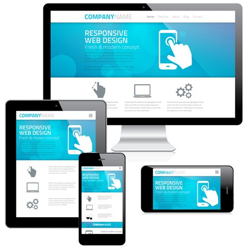
Responsive Web Design is the new catch phrase describing web site which is aware of the device that it is running on, and re-formats to suit that device. This means that a website may display with several columns on a wide screen, fewer of=n a smaller screen such as an iPad, and basically stacked in a single column on mobile phones.
For some time I have been designing sites inside a 960 pixel wide column which is a convenient option as an iPad is 960 pixels wide so it is an easy solution, however that may not be enough to get you to a mobile phone.
The whole site may display, however with zooming and re-scaling it may well end up being less than helpful.
Responsive web design needs an option to interrogate the device and on that basis determines which style sheet should be applied to this rendition. That means that there needs to be more than one, indeed generally three style sheets - one for phones, one for tablets, and one for more normal PC's.
This new layer of complexity leaves me at times wondering who wants to access a website on a mobile phone, beyond face-book and a bank, email and contacts. In the end it is no good being a dinosaur, the rise of the smart phone means that is what people are doing.
In WordPress there are a number of responsive themes available, and a number of responsive plugins. I will generally from this point forward be ensuring WordPress themes are responsive.
In Dot Net Nuke, there is a new twitter bootstrap regime which provides new measure of 12 columns, which get divided down depending on the width of the device. I quite possibly will be working with this when required. Otherwise my DNN sites will be built at 960 pixels, which will be good for PC's and Tablets.
I guess new technology is a new challenge. Just remember next time you are buy a mobile, when they tell you all the wonderful things you can do on it, you establish the possibility of voice communication.